
Select and Use Color for Both Effect and Enjoyment
When you begin to analyze a client’s space, one of the first things that will often come to mind is color. Why was the existing color chosen, and what does it say about your client?
While a color change may be the simplest, most expedient step to take for reimagining a space, the fear of using color can stop some people in their tracks. They will worry about which color to choose; whether it should be light/dark/warm/cool; where to use it; how to use it; how it will look and feel; whether they’ll get tired of it; how it blends with other colors; where to start and stop; and on and on.
Of course, color is one of the areas where a professional designer can step in and help. The reason is twofold: First, a professional has been trained in color and how to use it. Second, a professional can serve as an objective eye in the project, asking and answering questions from an unbiased perspective.
Calming client fears of color
Based on the “psychology of colors,” there are several ways to approach color in decorating that will help to calm these fears:
- If your client would like a particular room to feel larger, light, and airy, you should select lighter colors, since light colors recede and give the feeling of expanding space.
- If your client would like a particular room to feel warm and cozy, less large, you should select deeper shades of color. For the warm feel, you will gravitate toward the warm tones of reds and yellows.
- If your client would like a particular room to feel relaxing, blues and neutral tones will be the direction you should suggest to them.
- If your client would like a special room to offer stimulation and contrast, you should propose a black-and-white combo: deeper shades of one color mixed with neutrals or lighter tints of the same color for a monochromatic effect.
It may be helpful to lead your client on a shopping expedition to your favorite paint store or the paint section of a home improvement store. Beyond the normal have tear sheets or brochures of current color trends and combinations, they usually have photos of those colors in room settings to help you visualize. All of this will assist in narrowing down your client’s color preferences.
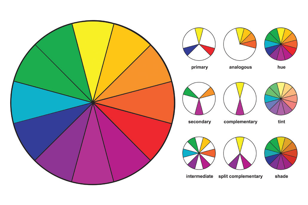
Ask your clients to be open to colors that they may not have considered previously. Explain that there are over 16 million colors available to choose from and that they would do well not to limit themselves just because they have never used a particular color before.
Remember, what people are really afraid of is taking a risk or making a blunder; that fear can be so real to them that, sometimes, they never make a decision at all.
Looking for interior design tips? Get in touch with TD Fall today.