
Pantone Releases Hot Colors for Spring 2017
Pantone, the self-proclaimed authority on Fashion Color, have released their Fall 2016 and Spring 2017 Color Reports. Based on what was showcased at the latest New York Fashion Week in September, Executive Director of the Pantone Color Institute Leatrice Eiseman said, "One of the things that we saw this year, was a renewed sense of imagination in which color was appearing in context that was different than the traditional.”
Spring 2017 Pantone Color Report
From colors that are bright and vivid to those that convey a sense of earthiness, the top 10 colors for spring 2017 are reminiscent of the hues that surround us in nature.
According to Architectural Digest, the seasonal Pantone Color Report is seen as a glimpse into upcoming styles for the year.
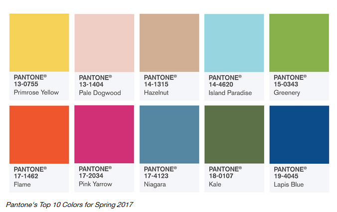
Surprisingly earthy and warm for the spring season, the list ranges from veggie-inspired Kale to Greenery; warm, muted hues Hazelnut and Pale Dogwood; soft blues Island Paradise and Niagara; and the more poppy Pink Yarrow, Flame, Lapis Blue, and Primrose Yellow.
Yet, when compared to their fall list, one can see how these colors evolved for 2017.
Fall 2016 Pantone Color Report
Of course, nothing exists in a vacuum, which makes it important to examine how this list of colors was developed for spring 2017.
Along with anchoring earth tones, exuberant pops of vibrant colors also appear throughout the collections. Transcending gender, these unexpectedly vivacious colors in our Fall 2016 palette act as playful but structured departures from your more typical fall shades.
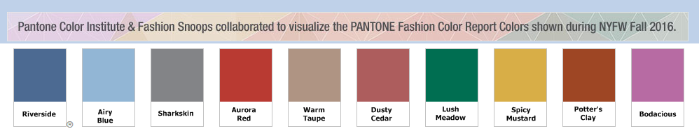
While the top 10 for Fall 2016 were heavy on the blues as well as reddish-brown shades, there were six colors that are brand-new to the Pantone universe of colors. When this palette of colors is considered relative to the list for next spring, it’s fairly easy to see how many of the top 10 colors evolved.
The similarities between the spring and fall reports don't end there. There are a lot of nature references, like in seasons past; this time around, the earthy vibes come courtesy of vibrant earth tones like Dusty Cedar and Lush Meadow.
As they do every year and season, the Pantone Color Institute surveys the designers at New York Fashion Week about their color choices, then develops the bi-annual color report for those of us in the fashion and home design industries to employ as a tool for the work we do.
Looking for interior design tips? Get in touch with TD Fall today.