
Interior Design Tips: Pick Your Own Color of the Year
For some in the design industry, the Pantone Color of the Year may as well be considered gospel. For these folks, there is no other possibility. And yet, with their choice of purple this year (well, “Ultra Violet” according to them), you’ll not be alone if you decide to look elsewhere for hot colors for 2018.After all, doesn’t it make sense to check in with one or two, or four, of the big paint companies to see what they have to offer as Color of the Year? We offer these choices with a large “Thank you” to the Décor & You Blog.AkzoNobel/Dulux Paint – Heart Wood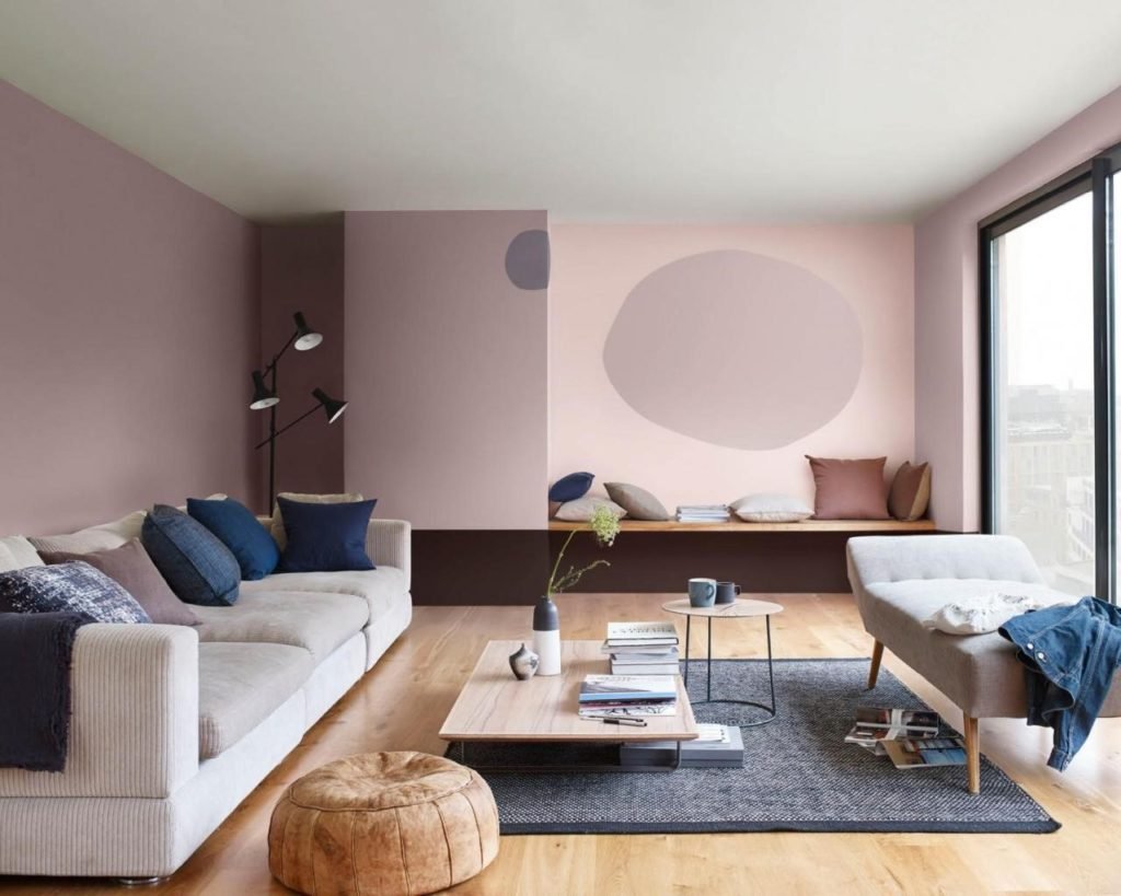 Heart Wood is the quietest shade of the bunch. AkzoNobel calls it a “grown-up pink” that echoes the look and feel of natural wood and leather. If you aren’t familiar with AkzoNobel, they are a paint and coating company headquartered in Amsterdam.The firm’s Global Aesthetic Center works with design and color experts around the world who look at technology, art, design, nature, architecture, and even fashion and music before selecting a color of the year. This year, they felt that people around the world are looking to escape the noise of everyday life when they are at home. Heart Wood brings that sense of calm, relaxation, and solace.PPG Pittsburg Paints – Black Flame
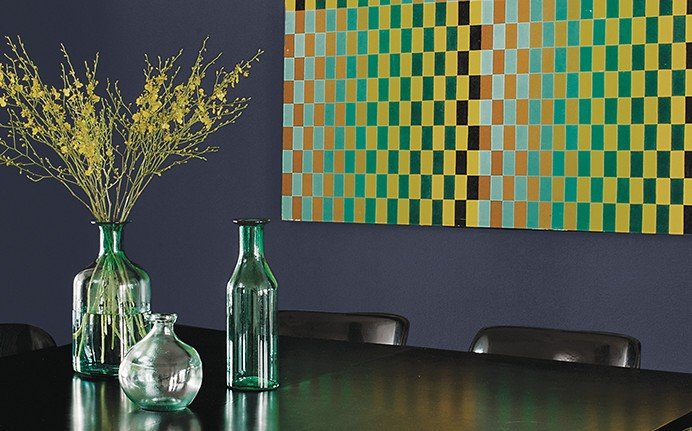 To select PPG’s color of the year, the global paint company has their top 20 color experts from all over the world meet for three days to present and debate their selection. This year, they crowned Black Flame and claimed it will be the “new neutral”.Black Flame is black with a hint of deep indigo. This shade was selected to satisfy consumer’s need for privacy, optimism, and a search for things classic yet modern. This color fits the bill. It’s timeless like the little black dress; it looks great on everyone and provides an excellent canvas to highlight other colors and accessories. This idea translates perfectly into interior decorating.Benjamin Moore - Caliente
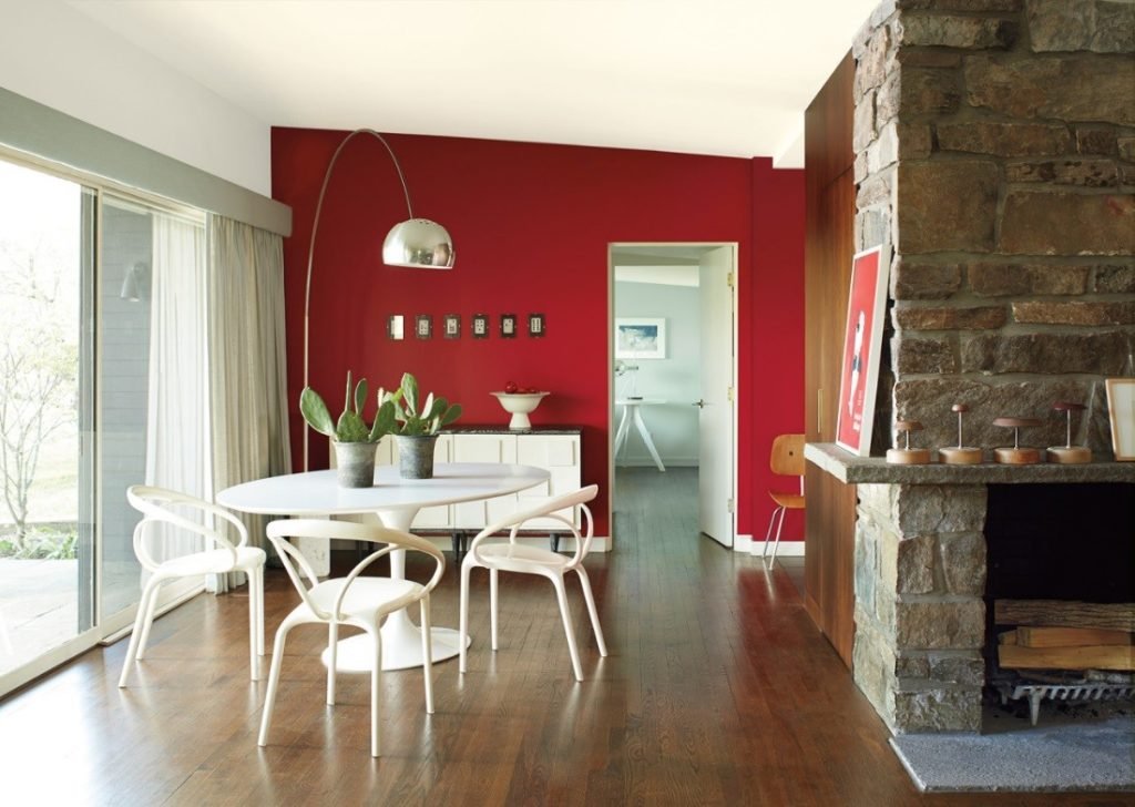 Caliente is the wild card of the bunch. This daring, energetic red is a bold choice. Benjamin Moore takes months to examine research from industry shows, fashion, and architecture seen around the globe. Red was seen prominently; in January’s Women’s March in Washington DC, in popular TV shows like The Handmaid’s Tale, and in Stockholm Royal College of Music’s concert hall.Caliente has a slight brown undertone, so it’s not a dull primary red. It evokes a sense of change, strength, and confidence. Use it to create a strong focal point or a lasting impression.Sherwin Williams – Oceanside
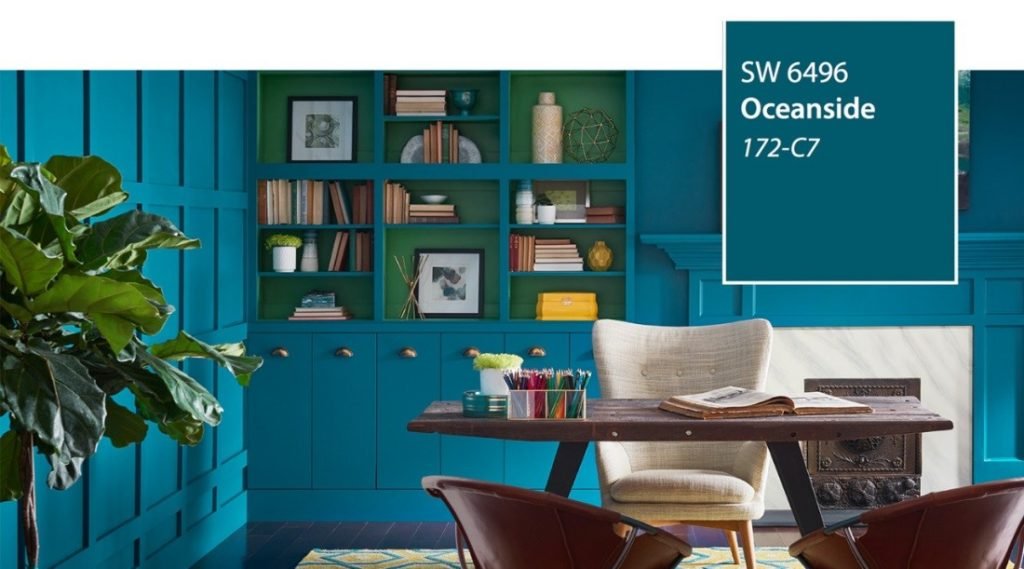 Oceanside is a gorgeous deep teal, almost a jewel tone. Reminiscent of the ocean and inspired by global travel, Sherwin Williams believes it will satisfy a homeowner’s search for adventure in a shade that is a balance of old and new.After examining influences from all over the world, their experts selected Oceanside for its versatility. It’s suitable for traditional spaces as well as modern; it invites a sense of clarity and is known to boost creativity. This is a color you can bathe your walls in or use more deliberately for points of interest.Looking for more new design trends, tips, and ideas? Get in touch with TD Fall today.