
Interior Design Trends and The Pantone Color of the Year 2022
As we leave 2021 behind and ring in the New Year, it’s time to also call up the latest from the folks at Pantone with their annual declaration of the Color of the Year 2022.
While many other paint brands proclaimed various shades of green as their color of the year, extolling its versatility, warmth, and feelings of growth, Pantone has selected a shade of periwinkle, Very Peri. They have also merged next year’s choice into four pre-loaded, mood-focused palettes with color combinations that integrate and complement Very Peri.

“Very Peri was selected for its blending of the faithfulness and constancy of classic blue with the energy and excitement of red. ‘As we move into a world of unprecedented change, the selection of Pantone 17-3938 Very Peri brings a novel perspective and vision of the trusted and beloved blue color family,’ Pantone Executive Director Leatrice Eiseman said. ‘Encompassing the qualities of the blues, yet at the same time possessing a violet-red undertone, Very Peri displays a spritely, joyous attitude and dynamic presence that encourages courageous creativity and imaginative expression’.” (Houzz.com)
Pantone Very Peri Color of the Year Palettes
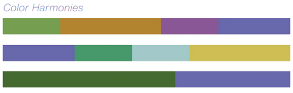
Realizing not every homeowner or designer will be completely comfortable with shades of blueish/lavender paint in every room, they have made these Color of the Year-themed palettes. These can be used with every other Pantone Colour and are available to share, save, and use in your design files within Adobe Photoshop®, Illustrator®, and InDesign®.
Balancing Act
“Balancing Act is a complementary palette of color whose natural balance of warm and cool tones support and enhance one another. The brilliance of Very Peri is intensified within this artfully calibrated palette, injecting a feeling of liveliness and visual vibration.”

Wellspring
“A holistic and harmonious blend of nature-infused shades, Wellspring highlights the compatibility of the greens with good-natured Very Peri and the health-giving properties of these deliciously subtle and nourishing hues.”
The Star of the Show
“The dynamic presence of Very Peri comes through in The Star of the Show, as we surround this happiest and warmest of all the blue hues with a palette of classics and neutrals whose essence of elegance and understated stylishness convey a message of timeless sophistication.”

Amusements
“Amusements, a joyous and whimsical color story of irrepressible fun and spontaneity is amplified by the carefree confidence and joyful attitude of Very Peri, a twinkling blue hue whose playfulness emboldens uninhibited expression and experimentation.”

Kravet Periwinkle Fabrics and Wallcoverings
A company that refuses to ignore design trends from wherever they may come, Kravet has made a variety of lovely periwinkle fabrics and wallcoverings available for some time.
Whether you're an interior designer or furnishing store owner, Ted has the experience and knowledge to help you adapt to changing times and to employ the latest Pantone Color of the Year 2022, 17-3938 Very Peri, to enhance your client’s home or office environment. Feel free to… Get in touch with TD Fall today